There is a pretty good chance that your tour guide profile photo isn’t very good…
It’s nothing personal, it’s just that almost all tour guides have bad profile photos. As I look back, almost 100% of my own profile photos were terrible too! In a moment, I’m going to share some profile photo tips.
The problem is that most profile pictures are treated as something of an afterthought. Often times we only spend 30-40 seconds looking around our computer and choosing from the photos we happen to have on offer. We upload it and then forget about it.
Unfortunately, when we do this we fail to appreciate just how important profile photos are. When a potential customer is looking at a tour, it only natural for them to want more information on the tour leader. While having a captivating and interesting written profile is important, remember that your picture can be worth a thousand words! Visitors to your page will be judging how friendly you are and utlimately deciding wether you look like someone interesting enough to spend some time with.
Other Profile photo tips:
To help you examine your own profile photos I’ve created a list of do’s and don’ts when it comes to your profile pictures. (think of them as profile photo tips) Furthermore, we’ll even check out a few of my favourite profile photos from tour guides around the web.
I believe that you are (or will be!) an amazing tour leader, so let’s make sure you have an engaging profile photo to match!
-Kelsey T
Finished Watching?
Let me know in the comments what your biggest pet peeves are when it comes to profile photos. Any profile photo tips for the rest of the community? We’d love to hear from you!
Transcript:
Hi there and welcome to Be a Better Guide! I’m your host, Kelsey Tonner, and this week, we’re talking about guide profile photos.
Now, this is a photo that goes next to a description of you as a tour leader or tour guide. It’s not necessarily the photos that you have in your tour description.
But here’s the thing, majority of tour guides actually have terrible profile photos and this is kind of a big deal because every day, visitors, potential clients, potential customers are coming to that website and looking at that picture, judging it, examining it in great detail trying to figure out who you are and if they want to come on tour with you.
There’s a bunch of do’s and don’ts that I’m going to share with you today for having an amazing guide profile photo. Now, I want to show you a couple of examples so let’s hop on to the computer.
Let’s start with some things to avoid. No selfies, especially those that are taken in a mirror or those that clearly show your arm.

No funky filters. I’m looking at all of you Instagrammers out there that like to put weird filters on, not the best place. No pixely or grainy photos. This tends to happen if there’re poorly exposed night shots or the lighting isn’t very good or the quality of the camera is not good.
No intense or serious photos. You really want to be looking friendly and approachable in your photo. Many guides unfortunately have a bit of a scow in their profile. No blurry or out-of-focus pictures. No sunglasses.
So many guides, even if you wear sunglasses all the time, please, please, please take off your sunglasses for your profile photo. It’s very important for them to be able to connect through your eyes. No full-body action shots.
The most important thing in your profile photo is to show the features of your face. Far away photos, not good as well. No pets, or kids, or props if possible.
Another common mistake is if your face is cropped in any way, so part of the top of your head is missing, maybe the bottom, or your chin, anything like that. No photos cropped from a larger photo.
This is often very obvious and it can reduce the quality of the image, but also sometimes you get weird floating body parts like your friend’s hand or something like that. So even if you look fantastic in that photo of you and your friends, you need to have a dedicated shot just for your profile.
I would avoid cartoons and caricatures like drawings of you in your profile. Again, people want to see the real you. For most cases, no black and white photos, and perhaps the greatest thing of all, no profile photo uploaded at all.
If you don’t have a profile section of your website, you really need to create one and this is a place where people can learn more about you. You don’t want a faceless silhouette on any of your online profiles.
Let’s talk about some things you can do.
Get a professional headshot, something with a lot of energy that’s taken by somebody who’s trained on how to use a camera.
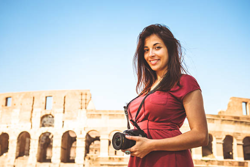
Have a big authentic smile and an authentic smile is really important, it tends to come from the eyes.
Want to make sure that you’re the focus of the image and that the photo has good composition. As a rule of thumb, your head and shoulder should fill the frame but not square on. This isn’t a passport photo shot. Ideally, you’re exuding approachability.
In regards to clothing, look the part. What do you normally wear when you’re guiding, that is great to include in your photo. Choosing a photo that looks like you is important and avoid old photographs where you look different or maybe had different hairstyles or facial hair.
Keep the background as simple as possible and in your element is ideal. If you work outside as a tour guide, having an outside background is really nice.
Let’s quickly look at a few fabulous guide profile photos. This is Safari Mamma Kagiso from Safari Specialists. Look at that warm, radiant smile and energy that comes through the photo.
Here is Zel Letterman on Jerusalem two-day tour. You can see his photo has that energy. He’s in his element. He’s right there in Jerusalem.
Pedro is an intrepid leader in Brazil. Has just a wonderful shot of him genuinely smiling and laughing.
A couple of examples from Backroads Tours are Federica Vergano and Fabio Marzi, two friends of mine who work in Italy and look at those fabulous smiles. They’re in their element. These are wonderful, wonderful people, and their personality comes through their photographs.
There you have it. Take a look at your own profile photo. Follow these do’s and don’ts and before long you’ll have a profile photo that is taking the interwebs by storm.
In the comments below, let me know, do you have pet peeves when it comes to profile photos, do you have some advice that you’d like to share with the community. I’d love to hear from you.
Thanks so much for being here. Please share this video if you enjoyed it and I’ll see you next time.


