How to Create Tour Descriptions That Actually Convert
You have an amazing tour experience, perfected through careful consideration of your ideal target guest. But it isn’t selling.
What gives?
Your sales page isn’t optimized.
Your website’s tour description pages work as your 24/7 sales team—and just like a great tour guide, they need the right tools and structure to convert browsers into eager guests.
This is what successful tour operators understand about creating high-converting sales pages that drive consistent bookings. Let’s examine real examples from thriving businesses who have implemented these proven practices, starting with the essential elements that belong at the top of every tour page.
The Foundation: Your Tour’s First Impression
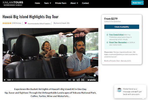
The name of your tour and a bold promise should appear prominently at the top of the page. Take Kailani Tours’ approach: “Experience the bucket list sites of Hawaii’s Big Island, all in one day. Sip, savor, sightsee through an unforgettable landscape: Volcano National Park, coffee, turtles, wine and waterfalls.” This hook immediately communicates value and creates anticipation.
Similarly, the Moab Adventure Center’s Arches National Park tour leads with: “VIP access to Arches National Park, expert guides, iconic sites and mantelworthy family photos without the hassle of parking or missing key sites.” This clearly addresses common pain points while highlighting unique benefits.
Media That Sells
Your media placement matters significantly. Professional video footage above the fold can be incredibly effective – when done right. Kailani Tours uses a professionally shot video that showcases spectacular moments from their tour. For those using video, consider implementing Wistia’s looping thumbnail feature – even on their free plan. This allows you to select a compelling section of your video to loop continuously, creating movement and interest without autoplay.
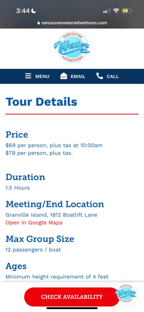
If you don’t have professional video, an image gallery featuring 50% smiling guests and guides, with the remaining 50% highlighting your unique experiences, works exceptionally well. Bulldog Tours exemplifies this perfectly with their food tour gallery, showcasing both happy participants and mouth-watering culinary highlights. For transport-based tours, like Vancouver Water Adventures, including images of your vehicles (boats, luxury vans, etc.) helps set accurate expectations.
Converting Interest Into Action
The “Check Availability” button consistently outperforms alternatives like “Book Now” or “Buy Tickets” in click-through rates. Major booking platforms like Viator and GetYourGuide use this language for a reason – it feels less committal while still moving potential guests toward booking.
Your call-to-action should remain visible no matter where visitors are on the page. On desktop, use a floating button that follows as users scroll. For mobile users, implement a persistent booking bar at the bottom of the screen that includes price and key booking information.
The Essential “At a Glance” Section
Tour details should appear immediately after your media section, before any lengthy descriptions. Include:
- Price
- Duration
- What’s included (and not included)
- Key logistics
- Cancellation policy highlights
Building Trust Through Social Proof
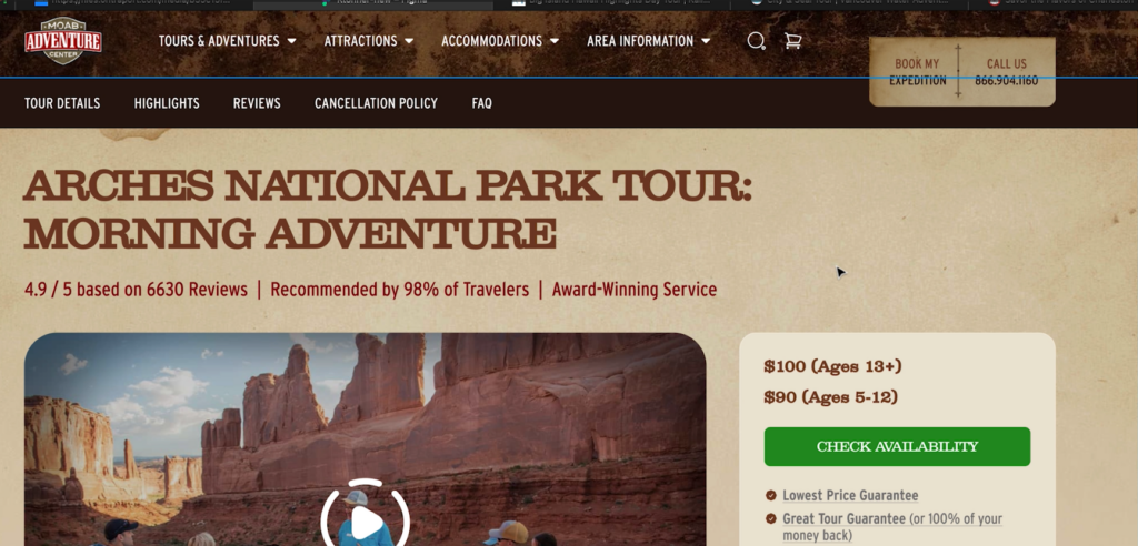
Social proof needs to appear early in your sales page. Showcase your total review count and rating prominently near the top. The Moab Adventure Center effectively displays “663 reviews, recommended by 98% of travelers” right beneath their tour title.
Later in the page, dedicate a section to carefully selected testimonials. Choose reviews that address common concerns and highlight your unique value. Make these swipeable on mobile devices for better engagement. Consider including video testimonials if available – they can be particularly powerful for higher-priced tours.
Creating Urgency Without Hype
For tour operators, natural scarcity exists – you have limited seats, specific seasons, and peak booking periods. Use this genuine scarcity effectively. The Moab Adventure Center does this well with a simple red callout: “Important: Arches National Park is one of Utah’s most popular destinations, and our morning tours sell out quickly. To secure your preferred date and avoid disappointment, we strongly recommend booking as soon as possible.”
Emotional Connection Through Magic Moments
Paint a vivid picture of the experience using sensory-rich language. The Arches National Park tour description excels at this: “Feel the crisp morning air as you witness the sun’s first rays painting iconic red rocks in mesmerizing hues. Listen in awe as your knowledgeable guide brings the Jurassic era to life. Smell the fragrant desert sage as you pose for perfect photos dwarfed by massive arches and balanced rocks.”
Removing Booking Barriers
Your “Lowest Price Guarantee” should appear near every booking button. This isn’t about being the cheapest option – it’s assuring guests they’re getting the best rate by booking directly with you. Similarly, emphasize your cancellation policy, framing it positively as “Free cancellation up to 24/48 hours before the tour.”
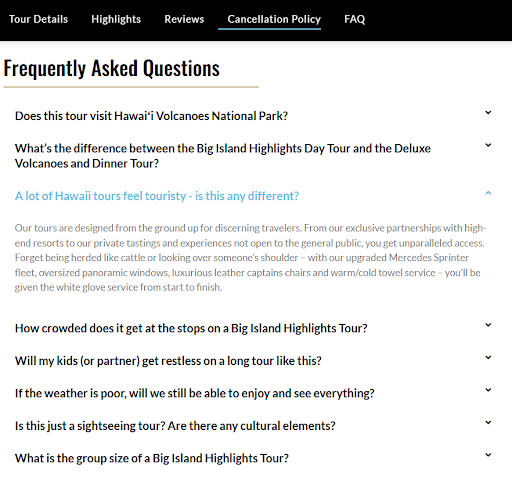
The FAQ section serves as your automated customer service representative. Focus on addressing common objections and concerns rather than basic information. Answer the questions that typically cause people to hesitate or reach out before booking. For Vancouver Water Adventures’ City and Seals tour, they address crucial concerns like weather conditions, seasickness, and bathroom availability.
Mobile-First Design Considerations
With over 60% of traffic coming from mobile devices, your page must be optimized for smaller screens. While longer pages are acceptable (users are comfortable with scrolling), navigation becomes crucial. Implementation of a sticky menu helps users quickly jump to relevant sections like “Tour Details,” “Reviews,” or “Cancellation Policy.”
Consider using expandable accordion-style sections for your FAQ and detailed information on mobile views. This keeps the page clean while allowing users to dig deeper into specific areas of interest.
Booking Software Integration
When implementing your booking software, ensure clicking “Check Availability” takes visitors directly to the calendar for that specific tour. Avoid sending them to a general tour listing page where they must search again for the right option. Each extra step increases the likelihood of losing the booking.
Additionally, eliminate nested tour descriptions – those redundant descriptions that sometimes appear within booking software. They often contain outdated or inconsistent information and can confuse potential guests.
Related Tours and Upsells
At the bottom of your page, thoughtfully present related tours with enough information for visitors to make informed decisions. Don’t just show a photo and title. Include key differentiators like price points, duration, or pickup times. For instance, if you offer a private tour option, mention it with a simple text link rather than competing with your main call-to-action button.
Additional Revenue Opportunities
Consider offering digital bonuses that add value without significantly increasing your costs. Food tours might include digital recipe books, while city tours could offer neighborhood guides for post-tour exploration. A beer tour in Prague successfully implemented this by providing a free nightlife guide highlighting beer halls and hotspots for after the tour.
The most effective tour sales pages aren’t just information repositories—they’re carefully crafted conversion tools that address customer concerns while building confidence in your experience. By implementing these proven elements systematically, you’re not just describing your tour. You’re actively selling it to your ideal guests.
Ready to optimize your tour sales pages? Download our free Irresistible Tour Description workbook and start implementing these best practices today.
